Developing Components
Components are reusable UI elements that allow us to split our UI and apps into independent pieces. In the Vodafone Design System, the components are built using several different patterns. Some components are created starting from primitive HTML tags (e.g. Heading is built on top of h1) using styled-components or a combination of styled-components and styled-system, while other components are built as a composition of other components (e.g. Input is built as a composition of TextField, Flex and Icons).
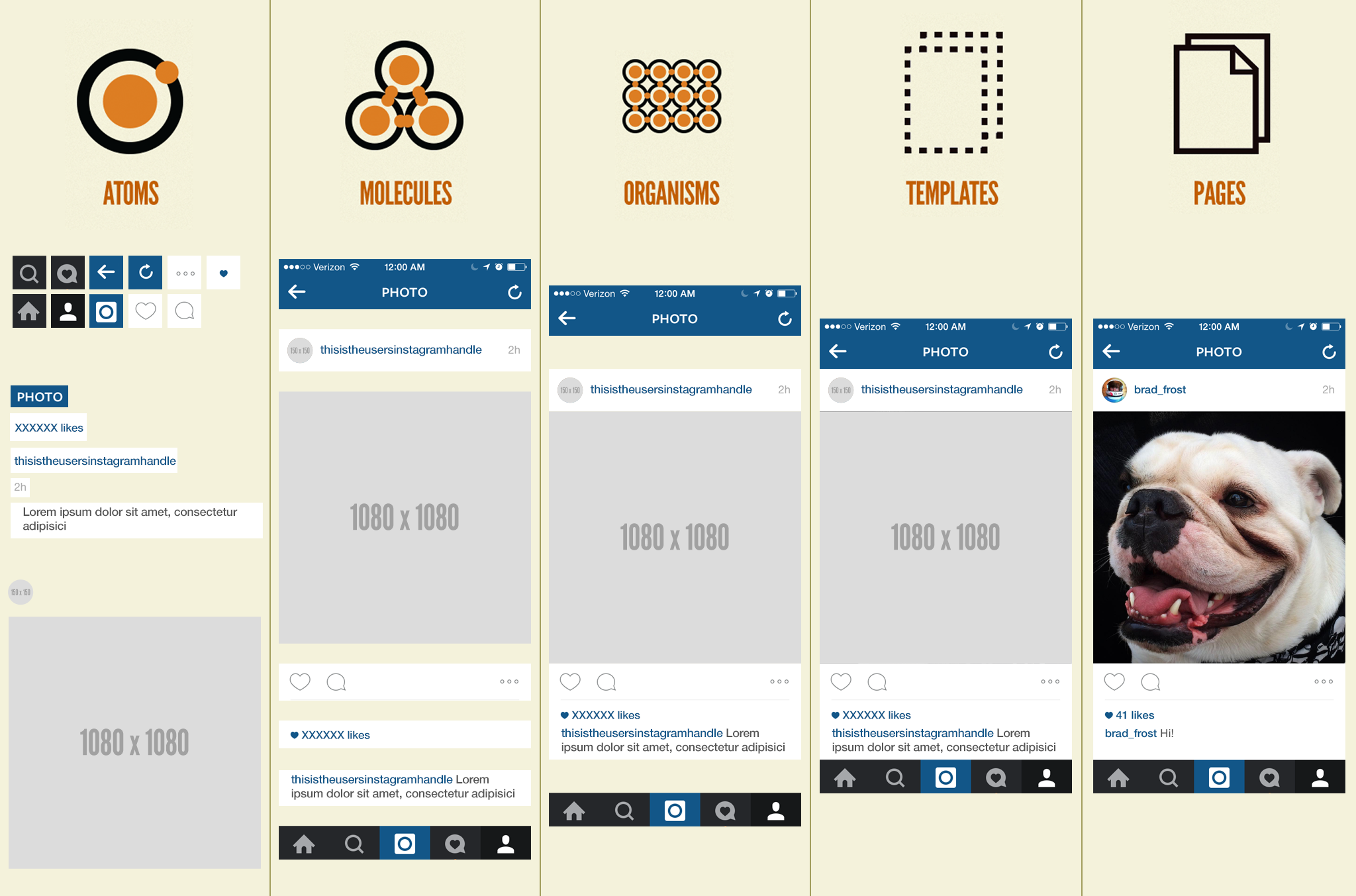
The methodology used to build the Vodafone Design System is called the Atomic Design Approach, and defines the following elements:
- Atoms are the basic building blocks of the system (e.g. label, input, button) as well as Design Tokens (e.g. color, typography, icons, grid, spacing).
- Molecules are groups of atoms bonded together (e.g. navbar, form-input).
- Organisms are groups of molecules joined together to form complex sections of the UI.
- Templates are groups of organisms that form pages.
- Pages are specific instances of templates where placeholder content is replaced with real representative content of what the user might ultimately see.
The scope of the Vodafone Design System is limited to Atoms and Molecules. Organisms, Templates and Pages should be created in the application that uses the Design System. The only exception to this rule might be the creation of recipes that guide users in building Organisms.
Ref Forwarding in React
Ref forwarding is a technique for automatically passing a ref through a component to one of its children. This is typically not necessary for most components in the application. However, it can be useful for some kinds of components, especially in reusable component libraries.
Although such encapsulation is desirable for application-level components like FeedStory or Comment, it can be inconvenient for highly reusable “leaf” components like FancyButton or MyTextInput. These components tend to be used throughout the application in a similar manner as a regular DOM button and input, and accessing their DOM nodes may be unavoidable for managing focus, selection, or animations.
In the Vodafone Design System, we use Ref Forwarding mainly in molecules or more complex atoms in order to decide which component is applied HTML props to. We are always returning only one HTML element per component which accepts all the props.
Atoms
Each atom is a styled-component that uses styled-system functions and props. Most atoms style a primitive html tag, such as h1 in the example below and do not require ref-forwarding as it is handled by styled-components. In this case, the ref is assigned to h1.
Variants
Use the variant API to apply complex styles to a component based on a single prop. This can be a handy way to support slight stylistic variations in button or typography components.
Molecules
Molecules are comprised of atoms. The design system comes with some molecules that can be used alone or as part of an organism. An example of a molecule is given by the <FormInput> component which was built based on a Grid to contain an Input field, a Text label, as well as Text hint and error messages.